

The Color of Emotion: Exploring the Psychological Impact of Color in Art
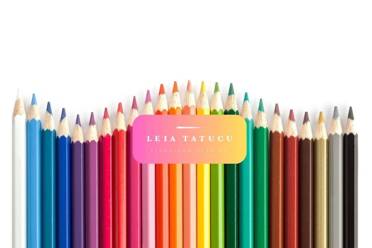
Color is one of the most powerful and immediate means of visual communication. It can symbolize different people, places, or things and is deeply tied to emotion. The colors artists choose to use in their artwork have profound, though often subconscious, effects on our moods and perceptions, thus deepening our understanding and enjoyment of art.
Introduction: A Palette of Feeling
When an artist dips their brush into a pot of paint, something remarkable happens—the dry pigment bursts into a lively hue. Each of these colors represents a plethora of feelings, leaping from the canvases of our existence. The understanding and control of color are critical components of an artist's toolkit. Color is a universal language of emotion.
Artists have long been aware of color's emotive capabilities. They wield it to provoke joy, sorrow, calm, or unrest. The patterns of our psyche are rendered visible on the canvas, translated through a spectrum of vivid and subtle shades. In understanding the psychological impact of color, we don't just enrich our viewing of art; we gain a lens into the minds of the artists who crafted these emotional masterpieces.
Color Theory Basics: Seeing the Rainbow Whole
Understanding the effect of color on our minds starts with a foundation in color theory - the basics that form the gravitational pull of color psychology in art.
The Harmony of Colors: Primary, Secondary, and Tertiary Pigments
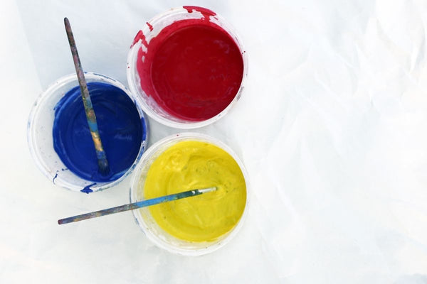
In the color world, every shade owes its existence to just a few primary colors—red, blue, and yellow. When these hues mix, they bring forth the secondary colors—green, orange, and purple. Tertiariness further divides the spectrum, creating infinite possibilities of color alchemy.
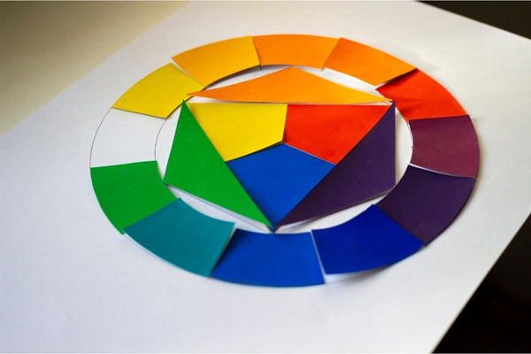
The Circular Serenade: The Color Wheel's Allure
The color wheel is a visual representation that organizes colors in a circular format, demonstrating their relationship to one another. This tool of art and psychology remains a cornerstone in understanding the way colors complement or contrast, and consequently, harmonize or agitate.
Psychological Impact of Colors: A Mosaic of Meaning
The colors an artist chooses are not arbitrary brushstrokes on the canvas; they are deliberate and carry intrinsic meaning.
Red: The Color of Passion and Energy
Red can be described as the color of extremes; it represents everything from love and passion to violence and war. It stirs up energy and excitement and demands attention, making it a common choice for artists who want to create striking visual statements.
Blue: The Serenity Sea
Blue is the color of the sky and the ocean, imbuing a sense of peace, tranquility, and harmony. It's a go-to for artists who wish to create a calming, cool atmosphere, a contrast to the warmth and turbulence of red.
Yellow: A Burst of Joy
Yellow shines like the sun, filling us with a sense of happiness and positivity. Symbolizing freshness, energy, and clarity, it's often used to emphasize the bright sides of life and its capacity for renewal.
Green: The Nature's Hue
Green embodies the natural world—lush forests and fertile fields. It's a restful color, representing growth, renewal, and stability. Artists often lean on green to evoke a sense of nature’s restorative power and harmonious balance.
Black, White, and the Yin and Yang of Color
These might be considered the absence and the sum of all colors, respectively. White signifies purity, innocence, and light, while black can denote mystery, power, and sophistication. Other colors—like purple for royalty, and pink for femininity—carry cultural and psychological connotations.
Case Studies: The Spectrum in Practice
Art communicates through color as much as form. Consider two artworks - one beloved, the other less so. These selections evoke contrasting emotions in me. Let's delve into their color stories.
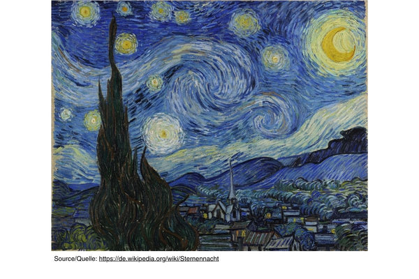
"Starry Night" by Vincent van Gogh
One of my favorite artworks by this artist. The swirling blues, whites, and yellows in this iconic piece create a captivating scene. The cool night air harmonizes with the warm, glowing stars and the radiant yellow moon. This blend not only captures the peacefulness of a starry night but also reflects the passionate spirit of the artist.
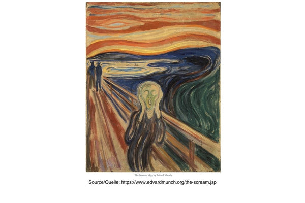
"The Scream" by Edvard Munch
The artwork deeply resonates with me, evoking primarily negative emotions. A screaming figure in the foreground stands against a blood-red sky, supported by a backdrop of turquoise blue. The surrealistic color palette not only captures the depicted agony but also conveys the subjective terror and eerie atmosphere, seamlessly extending the figure's existential dread onto the canvas itself.
Practical Applications: Art and Design
Understanding the emotional weight of color is indispensable whether you're appreciating art or creating it.
Mastering the Emotional Palette: Tips for Artists
Artists should be mindful of the emotional narrative their colors create. They can use color psychology to direct the viewer's gaze, suggest relationships between elements, and set the tone of the composition. Color temperature and saturation play their part in this grand play of shades.
From Vision to Viewing: Design Professional's Guide to Color
Color holds immense power in design, capable of defining the success or failure of a project. It serves as the foundation for branding, user experience, and spatial design. Designers need to master the art of color by comprehending how various hues interact in diverse settings and how colors communicate with and captivate the human mind within the artwork they observe.
Conclusion: A World Full of Colorful Conversations
Color in art transcends mere aesthetics; it delves into the realm of psychology. It communicates in a language beyond words, carrying profound meaning. Unveiling its influence enhances our encounters with the intense passion, tranquil serenity, and lively vibrance that artists infuse into their creations. As you immerse yourself in the artistry that surrounds you, may you perceive through the eyes of the artist and connect with their emotions, guided by the hues that intricately thread through the tapestry of your feelings.
Engage with our chromatic exploration! Share artworks that have stirred your emotions. Discuss the colors that evoke joy or melancholy. Comment below to delve into the impact of color on your feelings. Join our vibrant conversation on art, colors, and emotions - let's explore how hues resonate with our souls!
Leave a comment
This site is protected by hCaptcha and the hCaptcha Privacy Policy and Terms of Service apply.